
Responsive Offer Table
Built a scalable, mobile-first pricing table for packages, bonuses, and retail pricing that marketing can reuse across product types.
- Problem
- Package and retail prices broke on a phone.
- Role
- UI and frontend
- Built
- A mobile-first pricing table
- Tracking
- Not an experiment page
- Result
- Completed, and reusable across product types
| What's included | Package 1$797Value: $2,288 | Package 2$997Value: $2,688 | Best valuePackage 3$1,197Value: $3,088 |
|---|---|---|---|
| Feature 1 | |||
| Feature 2 | |||
| ★ BonusFeature 3 | |||
| ★ BonusFeature 4 | |||
| Feature 5 | |||
| Feature 6 | |||
Case study
Role: UI design + frontend implementation
Context: Buyers comparing packages on an offer page, on a desktop or a phone. Marketing needed one pricing table it could reuse across product types. I designed it and built it in HTML, CSS, and JavaScript.
The decision
A buyer comparing packages has to scan name, price, retail price, bonuses, and what is included, and still be able to do that on a phone.
Before
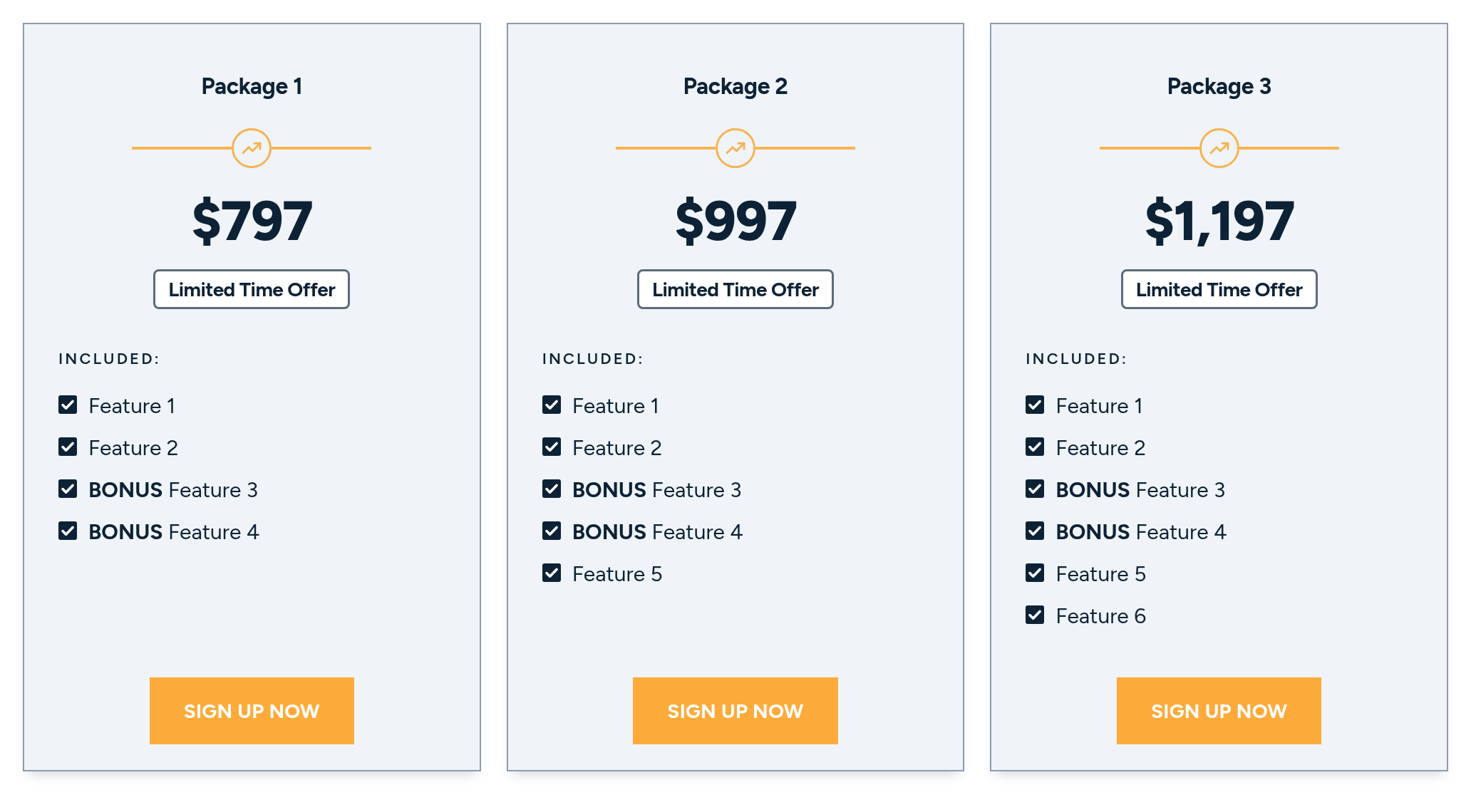
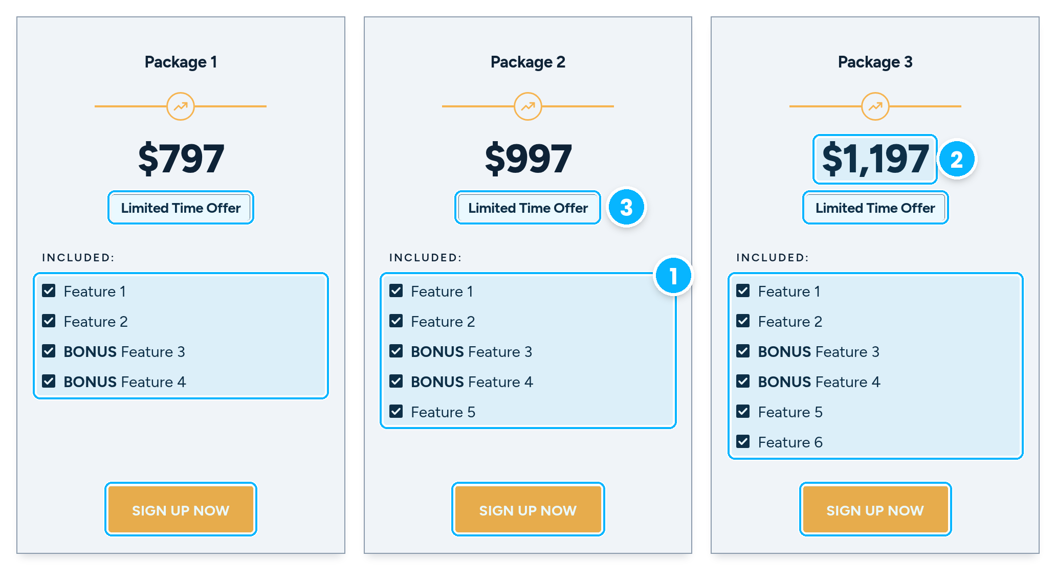
The old module was three cards with the same build: a plan name, a small divider icon, the price, a Limited Time Offer badge, an Included list of checked features, and an orange Sign Up Now button. The two bonus items are only labeled in text. Recreated here with generic packages and prices.
- Each card lists only what it includes, so to see what a higher package adds you have to compare the lists line by line across cards.
- Nothing marks a best value or shows savings. The bigger packages only show a bigger number.
- Every card repeats the same badge and the same button, so no package stands out.
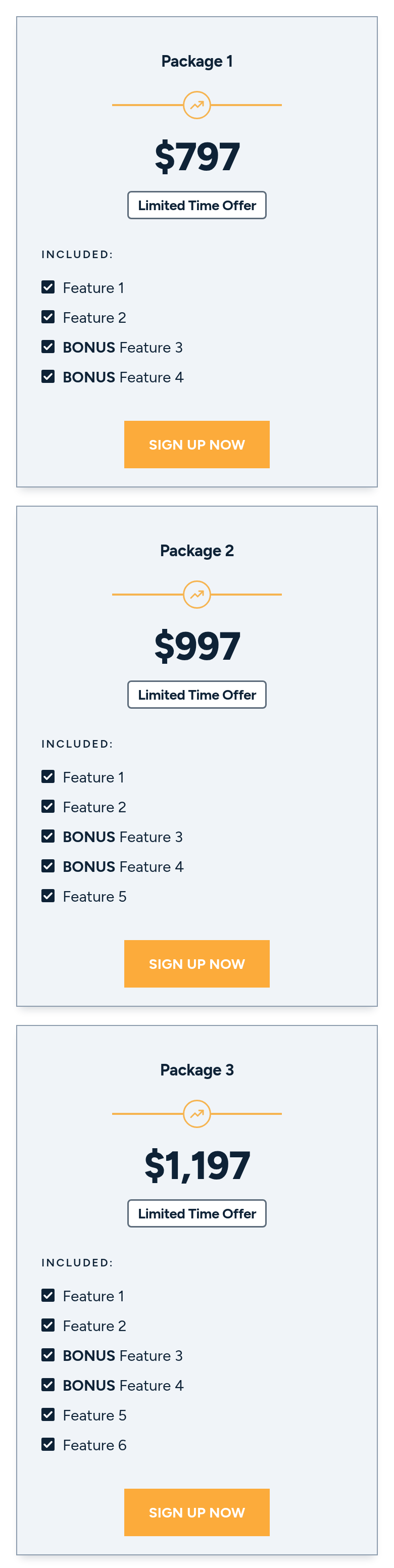
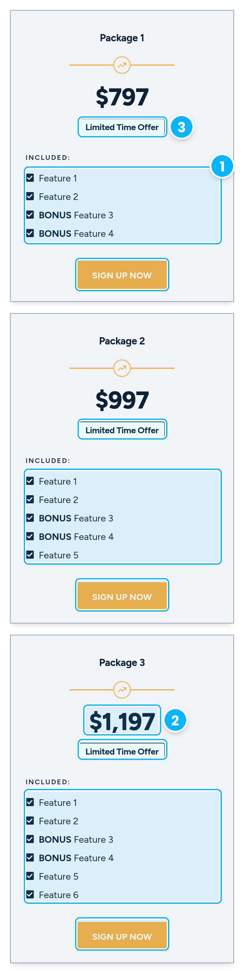
Phone width (390px), same callouts.
What I owned
- The layout: a table on a wide screen, stacked cards on a narrow one, with the same package information in both.
- The hierarchy inside each package: a colored header with the name, the price, and the retail value under it. Bonus items carry a ★ BONUS tag, and every row shows a check or an × so each package contents can be compared line by line.
- The actions: one package is marked Best Value, and each package ends in its own Buy Now button.
- The JavaScript that chooses the table or the cards from the width. The switch happens below 900px, which is the breakpoint this UI already uses. A Cards / Table toggle can force either view at any width.
Built within the constraints
- Plain HTML, CSS, and JavaScript. One list of packages renders both views, so the table and the cards cannot drift apart.
- No new breakpoint: the switch reuses the 900px one already in the UI.
- Concept to a delivered, previewable component took about three days.
Design system pieces
The live module is built from the system this site ships from. Package headers, the Best Value pill, and the Buy Now button use that accent, those surfaces, and the shared button. A check and the bonus tag use the success color. An × uses the danger color. The patterns stay the package header, the bonus tag, the Best Value pill, the check or × row, and one action per package.
How someone else reuses it
A new product fills in packages, bonuses, and prices. The table, the cards, and the breakpoint stay. Operators do not commission a new layout for each offer.
Shipped
OfferTable takes the packages. Each package has a name, a price, a retail price, bonuses, and the features it includes. At 900px and wider the component renders a table. Below that it renders stacked cards. A new product is a new list of packages passed into the same component. The preview on this page uses this site system for type, color, surfaces, and the button.
After
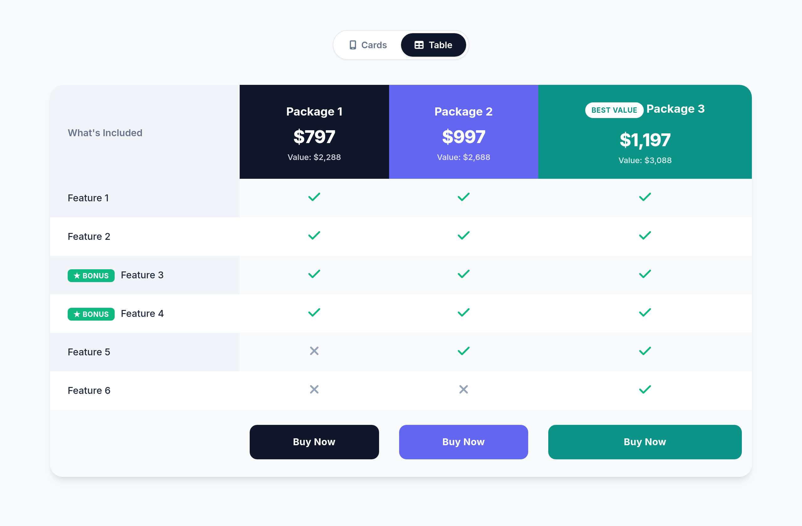
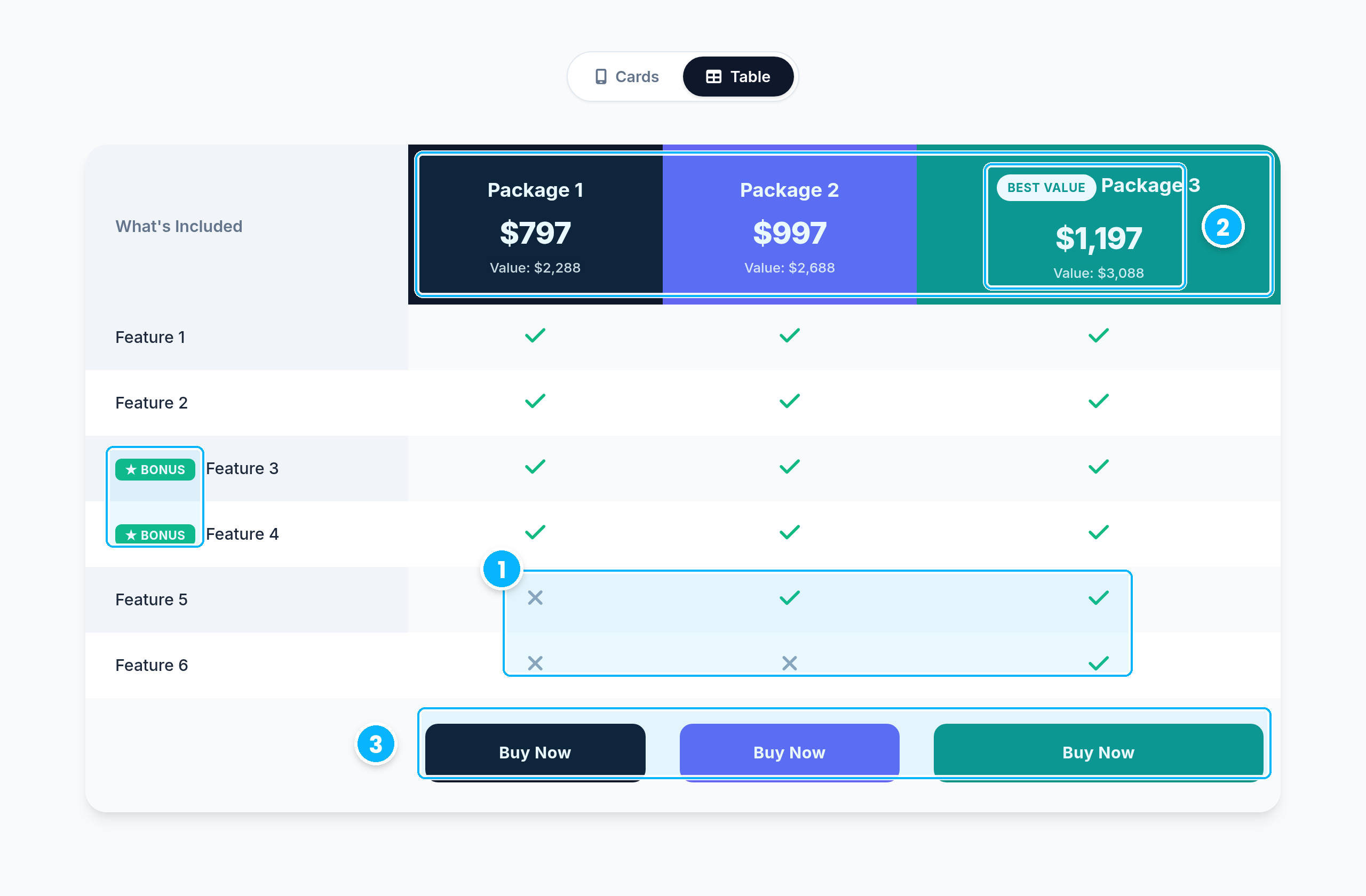
The same three packages in the offer table at desktop width:
- Check and × rows, plus ★ BONUS tags, show what each package adds.
- Package 3 carries a Best Value pill, and every price sits above its retail value.
- Each package gets its own colored header and its own Buy Now button.


Phone width (390px), same callouts. Below 900px, the same list of packages renders as stacked cards.
On the offer page
What I would do next
Run a few moderated sessions with buyers on phones to check that comparing packages in the card view is as quick as in the table.
Skills demonstrated: Responsive design, frontend implementation, component design, marketing operations.